
The Ultimate Guide to Resume Formatting: Why Perfect Layout Gets You Hired
September 30, 2025
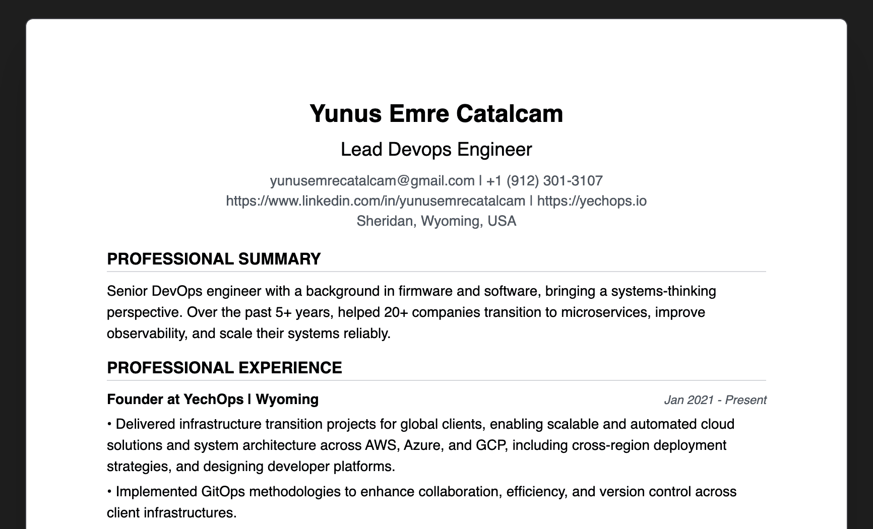
The harsh truth: 3 out of 4 resumes get rejected by ATS (Applicant Tracking Systems) before any human even sees them. The difference between landing interviews and getting ghosted often comes down to one thing: resume formatting.
After analyzing thousands of resumes and job applications, I've discovered the exact formatting principles that separate successful candidates from the rest. This isn't about fancy designs or creative layouts—it's about the science of readability, ATS compatibility, and human psychology.
Why Resume Formatting Matters More Than You Think
The 6-Second Rule
Recruiters spend an average of 6 seconds scanning your resume. In that time, they're looking for:
- Clear visual hierarchy that guides their eye
- Consistent formatting that feels professional
- Easy-to-scan sections that highlight key information
- Proper spacing that doesn't feel cramped or overwhelming
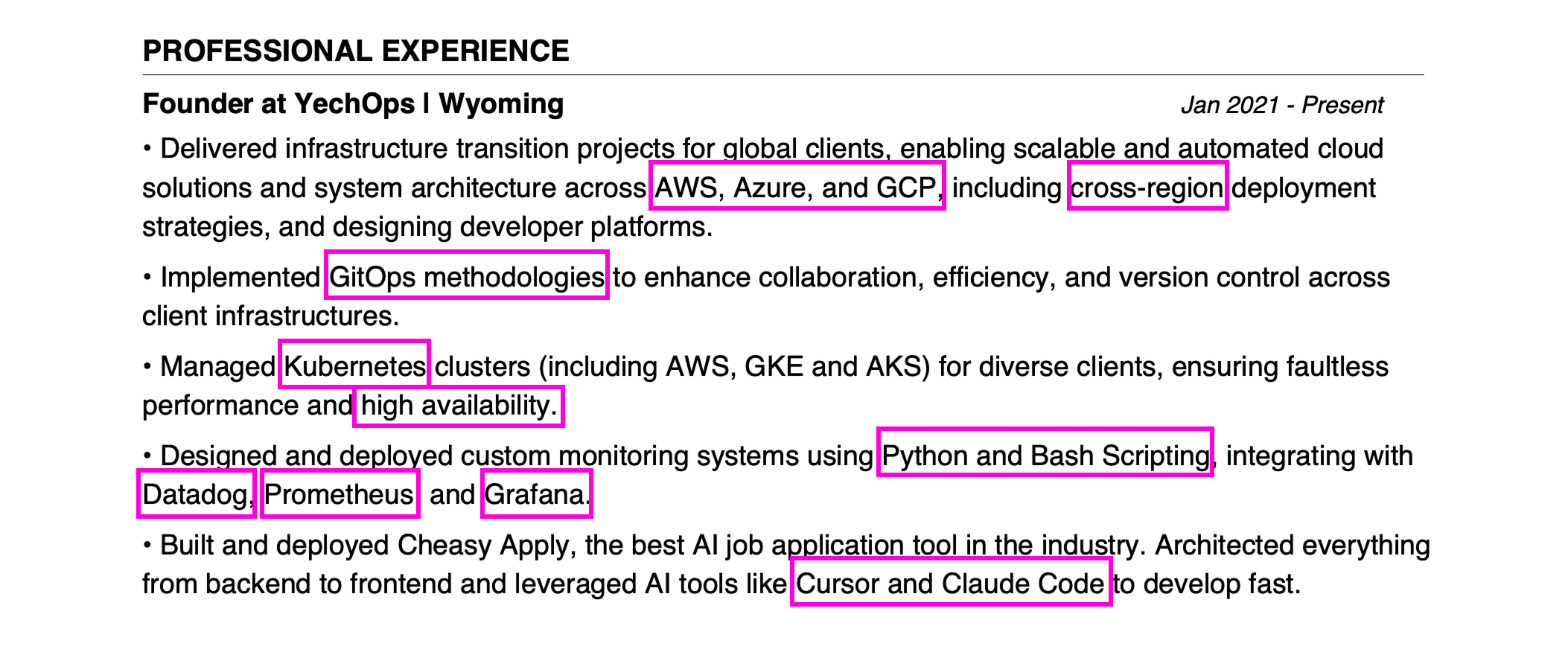
ATS Compatibility: The Hidden Gatekeeper
Most resumes never reach human eyes because they fail ATS screening. Here's what ATS systems look for: ATS-Friendly Formatting:
- Standard fonts (Arial, Calibri, Times New Roman)
- Consistent heading styles
- Proper spacing between sections
- Clean, simple layouts
- No graphics or complex formatting
ATS-Killers:
- Fancy fonts or decorative elements
- Tables or columns that confuse parsing
- Images or logos embedded in text
- Inconsistent formatting
- Complex layouts that break when parsed
The Science of Perfect Resume Formatting
1. Typography: The Foundation of Professionalism
Font Selection:
- Primary fonts: Arial, Calibri, or Times New Roman
- Size: 10-12pt for body text, 14-16pt for headings
- Consistency: Use maximum 2 font families throughout
Why this matters: ATS systems parse text more accurately with standard fonts. Recruiters also subconsciously associate clean typography with professionalism.
2. Spacing: The Psychology of White Space
Perfect spacing ratios:
- Line spacing: 1.15-1.2 for body text
- Section spacing: 1.5-2x the line spacing
- Margins: 0.75-1 inch on all sides
- Bullet point spacing: 0.5x line spacing
The psychology: Proper white space makes content feel less overwhelming and more professional. It also helps ATS systems distinguish between different sections.
3. Visual Hierarchy: Guiding the Recruiter's Eye
Heading structure:
- Name: 18-20pt, bold
- Section headers: 14-16pt, bold, all caps
- Job titles: 12-14pt, bold
- Company names: 11-12pt, bold
- Body text: 10-12pt, regular
Why this works: Clear hierarchy helps recruiters quickly find the information they need, improving your chances of getting past the 6-second scan.
4. Section Organization: The Flow That Converts
Optimal section order:
- Contact Information (top, centered)
- Professional Summary (2-3 lines max)
- Work Experience (reverse chronological)
- Education (relevant degrees only)
- Skills (technical and soft skills)
- Additional Sections (certifications, projects)
The logic: This order prioritizes experience over education (for experienced candidates) and puts the most relevant information first.
Common Formatting Mistakes That Kill Your Chances
Mistake #1: Inconsistent Formatting
Problem: Mixing font sizes, styles, and spacing throughout the document. Solution: Create a style guide and stick to it religiously.
Mistake #2: Poor Use of White Space
Problem: Cramped text that's hard to read or excessive spacing that wastes space. Solution: Use consistent spacing ratios and ensure adequate margins.
Mistake #3: Complex Layouts
Problem: Tables, columns, or graphics that confuse ATS systems. Solution: Stick to simple, linear layouts that parse easily.
Mistake #4: Inappropriate Font Choices
Problem: Decorative fonts that look unprofessional or are hard to read. Solution: Use standard business fonts that are both professional and ATS-friendly.
The Cheasy Apply Advantage: Perfect Formatting in Seconds
Here's the reality: manually formatting a resume to these standards takes hours of painstaking work. Most people either:
- Don't know these rules and create poorly formatted resumes
- Know the rules but lack the time to implement them perfectly
- Use templates that look generic and don't stand out
That's why I built Cheasy Apply.
Cheasy Apply automatically transforms any PDF resume into perfectly formatted, ATS-friendly documents in seconds. Simply upload your PDF resume and our AI ensures:
- Perfect typography with consistent fonts and sizing
- Optimal spacing that follows professional standards
- Clean visual hierarchy that guides the recruiter's eye
- ATS compatibility that passes automated screening
- Professional appearance that makes you stand out
The ROI of Perfect Resume Formatting
Before Cheasy Apply:
- Hours spent formatting resumes
- Inconsistent results across applications
- ATS rejections due to formatting issues
- Generic appearance that blends in
After Cheasy Apply:
- Perfect formatting in seconds
- Consistent professional appearance
- ATS-friendly structure
- Standout presentation that gets noticed
The Bottom Line
Resume formatting isn't just about aesthetics—it's about psychology, technology, and human behavior. The difference between getting interviews and getting ghosted often comes down to how well your resume is formatted.
The good news: You don't have to become a formatting expert. Cheasy Apply handles all the technical details while you focus on your career goals.
Ready to transform your resume formatting? Try Cheasy Apply today and see the difference perfect formatting makes.
Ready to automate your job hunt?
Free • No credit card required